vite에서 emotion 사용하기, 다크모드 환경 설정하기
1. emotion 설치 및 emotion/styled 설치
npm install --save @emotion/reactnpm install --save @emotion/styled
2. tsconfig.json에 아래 코드 추가
{
  "compilerOptions": {

    ...

    "jsxImportSource": "@emotion/react"
  },

}
3. vite에는 따로 babel 플러그인을 설치하거나 설정안해도 됨
GlobalStyle과 다크모드를 위한 Theme 설정하는 법
이를 위해서 3개의 파일이 필요하다.
GlobalStyle.ts
Theme.ts
useTheme.ts
1. Theme.ts
- 먼저 Theme의 타입을 지정해줘야한다.
- 해당 타입은 다크모드가 적용되는 styled 컴포넌트에 theme 데이터를 사용할 때 지정해줘야한다.
- light와 dark라는 객체를 정의하고 이를 mode객체에 감싸서 내보낸다.
export interface Theme {
  bgColor: string
  fontColor: string
}
interface ThemeGroup {
  light: Theme
  dark: Theme
}
/**
 * @light theme
 */

export const light: Theme = {
  bgColor: '#fff',
  fontColor: '#000'
}

/**
 * @dark theme
 */

export const dark: Theme = {
  bgColor: '#000',
  fontColor: '#eee'
}

const mode: ThemeGroup = {
  light,
  dark
}

export default mode
2.GlobalStyle.ts
- Theme.ts에서 정의된 테마 값으로 global스타일을 지정할 것이다.
- 매개변수로 theme값을 가져오고. body에 해당 theme값의 bgcolor와 fontcolor를 지정한다.
import { css } from '@emotion/react'
import { Theme } from './Theme'

const GlobalStyle = (theme: Theme) => css`
  * {
    margin: 0;
    padding: 0;
    -moz-osx-font-smoothing: grayscale;
    -webkit-font-smoothing: antialiased;
    box-sizing: border-box;
  }
  body {
    background-color: ${theme.bgColor};
    color: ${theme.fontColor};
  }
`

export default GlobalStyle
3. useTheme.ts
- getInitialTheme로 로컬스토리지에 현재 다크모드 값을 저장하고 다시 돌아왔을 때 다크모드인지 라이트 모드인지를 확인하고, 만약 theme값이 없거나 이상한 값이 들어있다면 사용자의 운영체제에서 선호하는 색상 테마를 가져와서 그 테마로 설정한다.
- 그리고 해당 값을 useState에 저장하고, toggleTheme함수로 바꿀 수 있도록 한다.
- 이때 로컬 스토리지의 값이 계속 바뀌어야한다.
import { useCallback, useEffect, useState } from 'react'

const useTheme = (): [typeof theme, typeof toggleTheme] => {
  const getInitialTheme = useCallback(() => {
    let theme = window.localStorage.getItem('app_theme') as
      | 'light'
      | 'dark'
      | null
    const INVALID_THEME = theme !== 'light' && theme !== 'dark'

    if (!theme || INVALID_THEME) {
      const { matches } = window.matchMedia('(prefers-color-scheme: dark)')
      theme = matches ? 'dark' : 'light'
    }

    return theme
  }, [])

  const [theme, setTheme] = useState(getInitialTheme)

  const toggleTheme = useCallback(() => {
    setTheme(prevTheme => (prevTheme === 'dark' ? 'light' : 'dark'))
  }, [])

  useEffect(() => {
    window.localStorage.setItem('app_theme', theme)
  }, [theme])

  return [theme, toggleTheme]
}

export default useTheme
결과적으로 App.tsx에 설정하는 법
import { Global, ThemeProvider } from '@emotion/react'
import styled from '@emotion/styled'
import useTheme from './styles/useTheme'
import GlobalStyle from './styles/GlobalStyles'
import { default as THEME } from './styles/Theme'
import ThemeSwitch from './components/ThemeSwitch'

function App() {
  const [theme, onToggle] = useTheme()

  return (
    <>
      <ThemeProvider theme={THEME[theme]}>
        <Global styles={GlobalStyle(THEME[theme])} />
        <MainContainer>
          <ThemeSwitch
            checked={theme === 'dark'}
            toggleSwitch={onToggle}
          />
          <ProfileContainer>dsadsdadsasda</ProfileContainer>
        </MainContainer>
      </ThemeProvider>
    </>
  )
}

export default App

const MainContainer = styled.div`
  margin: 0 auto;
  max-width: 780px;
`
const ProfileContainer = styled.div`
  margin: 1rem;
`
- emotion의 Theming을 사용 - ThemeProvider를 이용해서 theme라는 값을 하위에서도 사용가능하도록 한다.
-> 스타일이 props.theme지정된 구성 요소로 테마에 액세스하거나 테마를 CSS 소품으로 허용하는 기능을 제공하세요.
- emotion의 Global을 사용 - 전역 CSS를 적용하기 위해 사용 Global 태그 아래로 다른 컴포넌트를 넣어주면 Global style이 적용된다.
- ThemeSwitch로 간단하게 버튼을 클릭하면 theme값이 바뀌도록 함
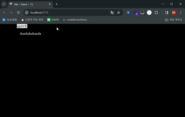
결과
참고 자료
https://emotion.sh/docs/install
https://emotion.sh/docs/theming
https://emotion.sh/docs/typescript
https://emotion.sh/docs/globals
https://velog.io/@pius712/%EB%A6%AC%EC%95%A1%ED%8A%B8-%EB%8B%A4%ED%81%AC%EB%AA%A8%EB%93%9C-emotion